00
problem
The challenge was designing a fun and memorable typographic exhibit for the class type museum, a well known and respected exhibition at the university. The pressure was real knowing how established the exhibit already was, and the goal was to create something that not only looked visually striking but also felt interactive and engaging for anyone who came across it.
solution
The idea came as a sudden stroke of inspiration, what if the exhibit made it intentionally difficult for people to read the typography? Playing with the way we perceive letters, words, and meaning, the exhibit was turned into an interactive game for the audience. Posters were designed with challenging typography and cards were handed out for people to fill in what they thought the posters said, sparking genuine curiosity and conversation. To make it even more memorable, freebies were included in the form of mini poster cards that visitors could take home as a little keepsake from the experience. It ended up being a fun and thought provoking exhibit that got people stopping, thinking, and engaging in a way that felt anything but ordinary.
Can you Read Me? is a typographic exhibit that challenges the way we see and interpret the written word. Built around a bold red, black, and white color palette, the exhibit features a series of distorted typographic posters where letters are blurred, jumbled, flipped upside down, reversed, or missing entirely. The whole experience was designed to make people stop and truly engage with typography in a way they never have before, questioning how we read, what we recognize, and what meaning we pull from something even when it is barely legible.
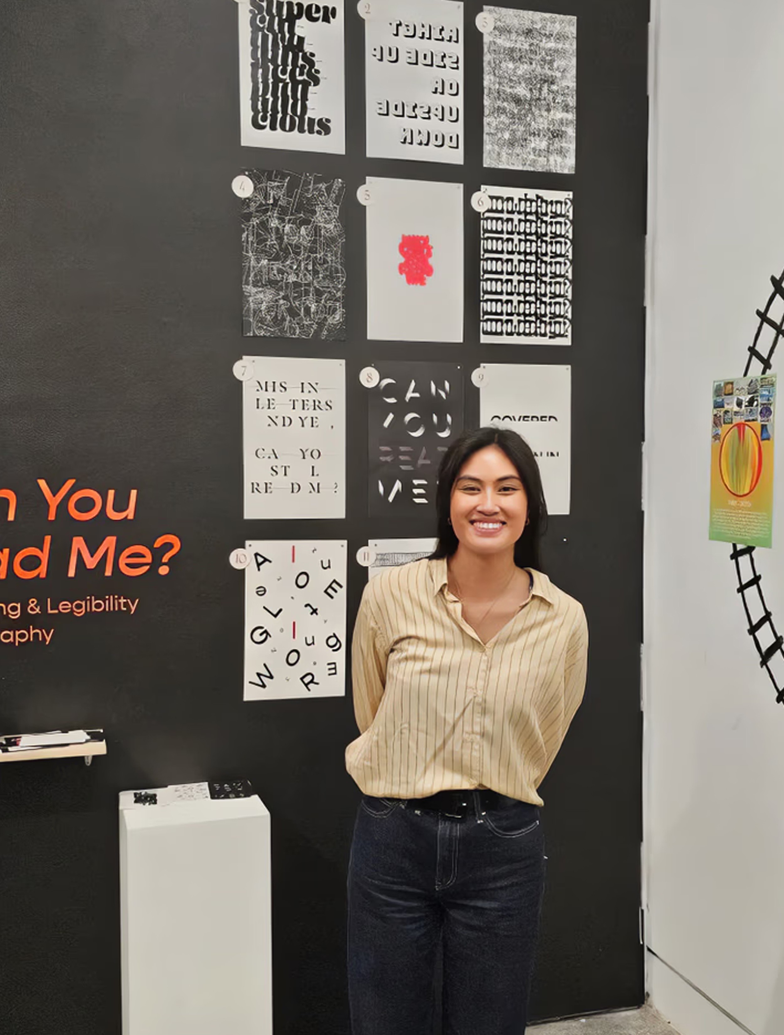
Can you Read Me? was a huge success and easily one of the most visited exhibits at the museum. Crowds consistently gathered around it and the response was overwhelmingly positive, with many people stopping to congratulate and share how much the work resonated with them. What was especially touching was hearing people interpret the exhibit as a representation of how neurodivergent individuals perceive the world around them, a meaning that was never originally intended but made the whole experience even more profound and meaningful. The giveaway mini poster cards were a hit as well, with nearly all of them taken home by visitors by the end of the exhibition. All that was left were the posters themselves, and honestly that said everything about how well it was received.
year
2024
timeframe
3 months
tools
Framer
category
Design Exhibition


see also


